Opinion: Dumb Ways to Die

Dumb-Ways-to-Die_Eat-a-tube-of-superglue

In the words of Metro Trains:


So what’s it all about?

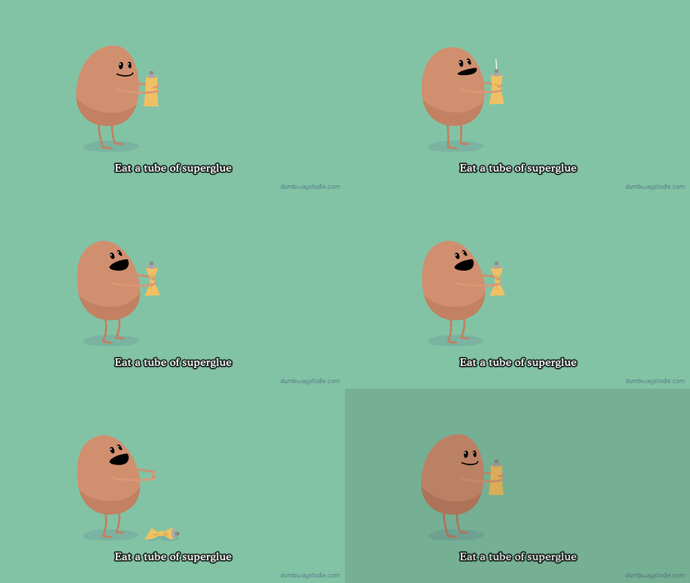
Dumb Ways to Die is a YouTube video and song which delivers a train safety message in an innovative way. It features cute singing and dancing characters dying in a multitude of ways to illustrate that getting hit by a train is a “Dumb way to die”.

Continue reading “Opinion: Dumb Ways to Die”

When Advertising Fails – Part 4

I find that as a Marketing student I seem to pay more attention to organisations’ ads and marketing strategies than the lay person would. That’s why I find it especially amazing when even I have poor brand recall from an advertisement I just watched/saw/heard/etc.. What I’m finding more prevalent than ever are ads which do not coincide with the brand identity. That is, you could play an ad and put any old brand logo at the end without changing the ad or its resulting effectiveness.

However, this one confused me:

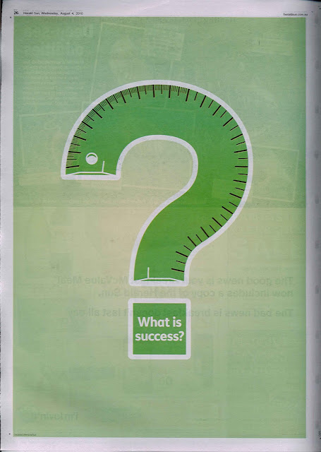
Another instalment to the When Advertising Fails series is a full page display found in yesterday’s Herald Sun (Wednesday, August 4, 2010).

The ad features a green ruler of some kind twisted into the shape of a question mark, along with the text What is success?. What confused me is that nowhere on the advertisement is any brand mentioned. Couple that with the fact that a full page ad in the Herald Sun could be costing them up to $40,466.58 this ad is on hell of a waste of money!
To answer the question: definitely not your ad!
I realise that I’m going out here on a whim and criticising an ad which may/may not be effective. The one thing I would say is positive is that it caught my attention with it’s simplicity and lack of direct brand promotion. What I’d love to see is a follow up campaign to this ad, building on the surreptitious nature of this one. Maybe they could create some ground swell and have a big reveal at the campaign’s conclusion? Although I don’t think this is very likely.

So for now, I’m going to assume it’s not part of an overall strategy and award it:

Advertisement Effectiveness: 2/10 (for lack of brand identifiability)

—————

Update (05/08/10): If anyone knows who the agency or brand behind this campaign is, please let me know in the comments section below!

Update (02/09/10): I’ve been following this campaign over the past few weeks and so it turns out, the client is CareerOne. There have been follow up advertisments in newspapers and television commercials. I even saw a banner ad for the campaign on YouTube!
It also turns out that CareerOne is owned by News Limited (known as News Digital Media in the digital space), which explains the ability to publish full page newspaper ads without fear of the budget. I still feel this campaign hasn’t been effective though. This judgement is based on the campaign’s poor execution.

What I learned about Marketing whilst skydiving

Nothing.

But, it was bloody amazing! Freefalling from 14,000 feet is the most incredible thing you can experience.

Here are a couple of photos:


(Here’s some link love to the guys at Skydive Nagambie who ROCK!)

Although, I did have a minorly Marketing/Advertising related thought:

Red Bull should do an advertisement containing someone drinking a can of Red Bull whilst in freefall. It matches their brand image (i.e. “Red Bull gives you wings”, etc.), and would look extraordinary! I envision the can beneath the skydiver (held by them, someone else or shots of a combination of both) and they drink the stream of liquid as the wind catches it & it flies upward into their mouth.

Do it like this (watch what happens when the third guy grabs the bottle towards the end of the video):

NOT like this:

And a note to Red Bull GmbH: I’d like a nice compensation plan for my magnificent ad suggestion. I can be contacted via email.

Why Facebook opts for “like”, drops “become a fan” terminology

If you’re a regular Facebook user, you’d have probably noticed that Facebook recently trashed it’s “become a fan” language and opted for a more generic “like” feature for it’s branded pages.

In a way, this seems a more intuitive way of connecting to brands you “like” not necessarily a “fan” of. Becoming a fan does seem to imply an intimate connection with the brand which requires more user commitment. This is detrimental to marketing a brand, since users that brands wish to be influencing and converting need to be engaged before “becoming a fan” to begin with. Facebook’s decision to transition this language to “like” a brand attempts to fix this problem.

Here’s the document explaining the change:

But, is that the real reason Facebook has made the decision? I argue not!
Facebook says that users click the “like” button almost twice as much as they click the “become a fan” button. In real terms, Facebook is trying to boost the number of connections users have to brands.

What’s the reason for this? Revenue!
Most Facebook pages gain their user connections through Facebook advertising. So essentially, Facebook is endeavouring to double their revenue from brand advertisements with a simple terminology tweak.

They claim that liking a brand is a much more natural option that will streamline the site, but as Julian Cole contends on his Adspace Pioneers blog, it may actually create more confusion as to which Facebook adverts are for Facebook branded pages, and which are for external websites.

What do you think? Do you “like” Facebook’s new terminology?

When Advertising Fails – Part 3

In a recent developer conference, Apple previewed it’s new iPhone OS 4 (some really cool stuff coming, definitely worth checking out). At this event, they announced that there are now over 185,000 Apps available on the App Store for iPhone and iPod touch, including an additional 3,500 iPad Apps. This event took place on April 8, 2010.

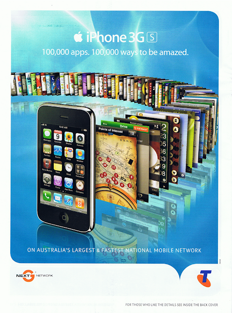
Yesterday (April 22, 2010) I caught a glance of a Telstra brochure which was an insert to yesterday’s Herald Sun. On the back page was an advertisement for iPhone. As always, it was well designed and visually stunning, however it was vastly incorrect on a major detail – the number of Apps:

Sorry Telstra, but your lack of attention to detail has landed you this edition of the When Advertising Fails series.

As a side note, the App Store has had in excess of 100,000 Apps for almost six months. It was originally announced in an Apple press release on November 4, 2009!

Advertisement Effectiveness: 5/10 (for lack of attention to detail)

When Advertising Succeeds – Part 1

As a contrary to the When Advertising Fails series I’ve begun, I’m also going to make comment on advertising success stories in a series entitled When Advertising Prevails.

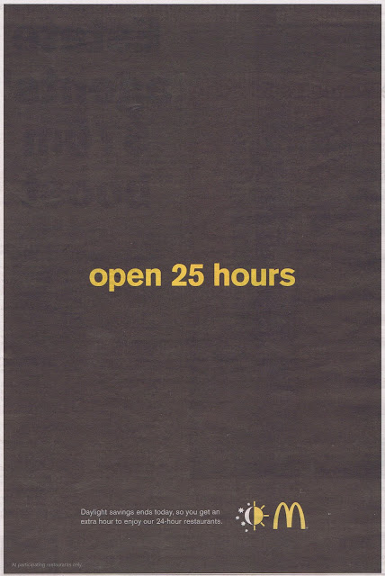
The first is an advertisement by McDonald’s from the Melbourne Herald Sunon Sunday, April 4, 2010 (Easter Sunday). This was the first day of the end of Eastern Standard Daylight Savings Time.

I thought this ad was quite clever and a nice play on current events. At least they’re keeping their advertisements fresh and new.

A much more successful ad than the Labour Day ad produced earlier in March this year by the TAC.

Advertisement Effectiveness: 7/10 (for originality, simplicity & intriguingness [if that’s a word?])

When Advertising Fails – Part 2

The second instalment to the When Advertising Fails series is somewhat shocking to me considering the organisation who produced it.

The newspaper print ad was taken from the Melbourne Herald Sun on Labour Day this year (Monday, March 8, 2010) and features an awareness campaign about driver fatigue. It was produced by the Transport Accident Commission (TAC) and what disappointed me specifically was that TAC campaigns are usually very hard-hitting, emotive and effective. They’ve dropped the ball on this one.

Fatigue may kill on the roads, but a bland advertisement definitely fatigues your brand.

Advertisement Effectiveness: 2/10 (for lack of impact)

When Advertising Fails – Part 1

Welcome to the 1st post of When Advertising Fails.

The following advertisement was taken from my local paper a few weeks ago, the Whitehorse Leader. It illustrates how a low budget can cost greatly in effectively delivering your message. The lack of budget being the lack of colour in the ad.

Below, is how the Fire Danger Ratings are expressed effectively on the Country Fire Authority (CFA) website.

The lesson to be learned: don’t skimp on the budget when advertising. Or if you must, at least review the ad prior to it going live. The lack of colour in said advertisement renders it virtually useless.

Advertisement Effectiveness: 3/10 (for lack of proofreading)

Coca-Cola gets a GRIP on marketing

Recently in Australia, the Coca-Cola Company has launched its new ‘Contour Grip bottle’ which has already been rolled out across the world. Looking beyond Coca-Cola’s useless claim of being more environmentally friendly by reducing the polyethylene terephthalate (PET) in their bottles by 5% compared to the previous design[1] (5% is hardly a commitment to sustainability), I do think that Coca-Cola is onto something here.

There are two reasons why this is a great innovation:

1. The new contour design of the bottle gives the impression that the new bottle contains more liquid.

Sure, consumers are not idiots and realise that it’s still a 600mL bottle as it always has been. However, one of the reasons Coca-Cola gained such a massive market share many years ago was from the visual illusion their contour bottle provided in their original design, released back in 1916[2].

2. I realised that when I used to hold a bottle of Coke, I used to hold it around the neck and/or label. By creating a section to ‘grip’, it essentially forces customers to grip the bottle in that section, and leave the label (i.e. brand advertising) freely unobstructed to the view of onlookers.

I don’t know whether these were two ideas Coca-Cola considered when developing the new design, but well done nonetheless.

______________________________
References:
[1] The Coca-Cola Company. (4 September, 2007). News Release: GET A GRIP ON THE NEW COCA-COLA CONTOUR BOTTLE. Retrieved 21 March, 2010, from The Coca-Cola Company: Press Centre: Press Releases: http://www.thecoca-colacompany.com/presscenter/nr_20070904_ccna_grip_bottles.html

[2] The Coca-Cola Company. (26 March, 2008). Get a Grip. Retrieved 21 March, 2010, from Coca-Cola Conversations: http://www.coca-colaconversations.com/my_weblog/2008/03/get-a-grip-1.html